It’s been a while since my last update.
Since then, I’ve been trying a new way to take notes. I already do it a ton, so I might as well start trying to make a curriculum graph out of it. While learning web development concepts and fundamentals, I’ve been trying to write everything I learn into bite-sized topics and linking them with previous topics.
And instead of trying to manually do data-entry inside of some Postgres database, I figured using Obsidian is also a great way to develop a “curriculum graph”.
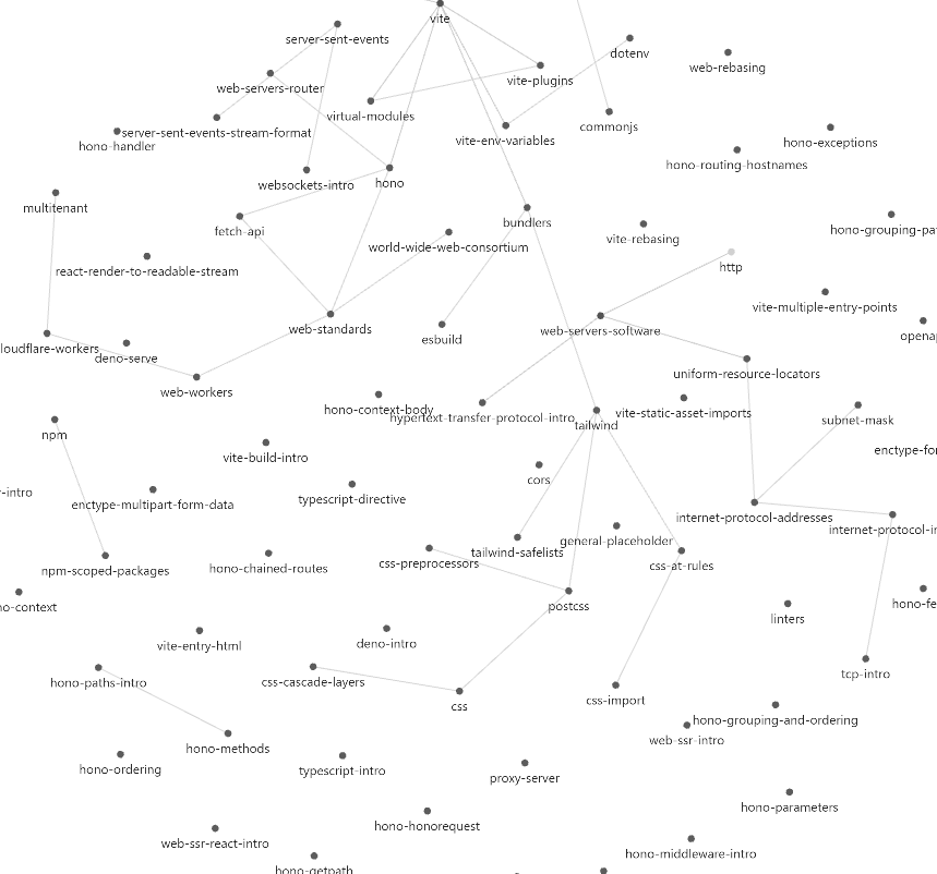
Now, one of their selling points was how it lends itself to connecting your knowledge. But I don’t think I really liked the actual Obsidian node graph, which looks pretty and cool but also pretty disorienting:
And I didn’t like how making connections forced you to go into one of the pages to type in the name of the related topic you want as a wiki link. It makes sense, but I wanted a more structured and flow-chart view of things. I wanted to just drag and click to make an edge without typing, and specify encompassing weights (as discussed in the FIRe algorithm in Reading the Math Academy Way).
Then I learned about a feature I never ended up using: canvases! Turns out that it was a perfect fit.
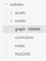
As of now, each “curriculum” looks like a folder in an Obsidian vault:
And here’s what the .canvas file looks like:
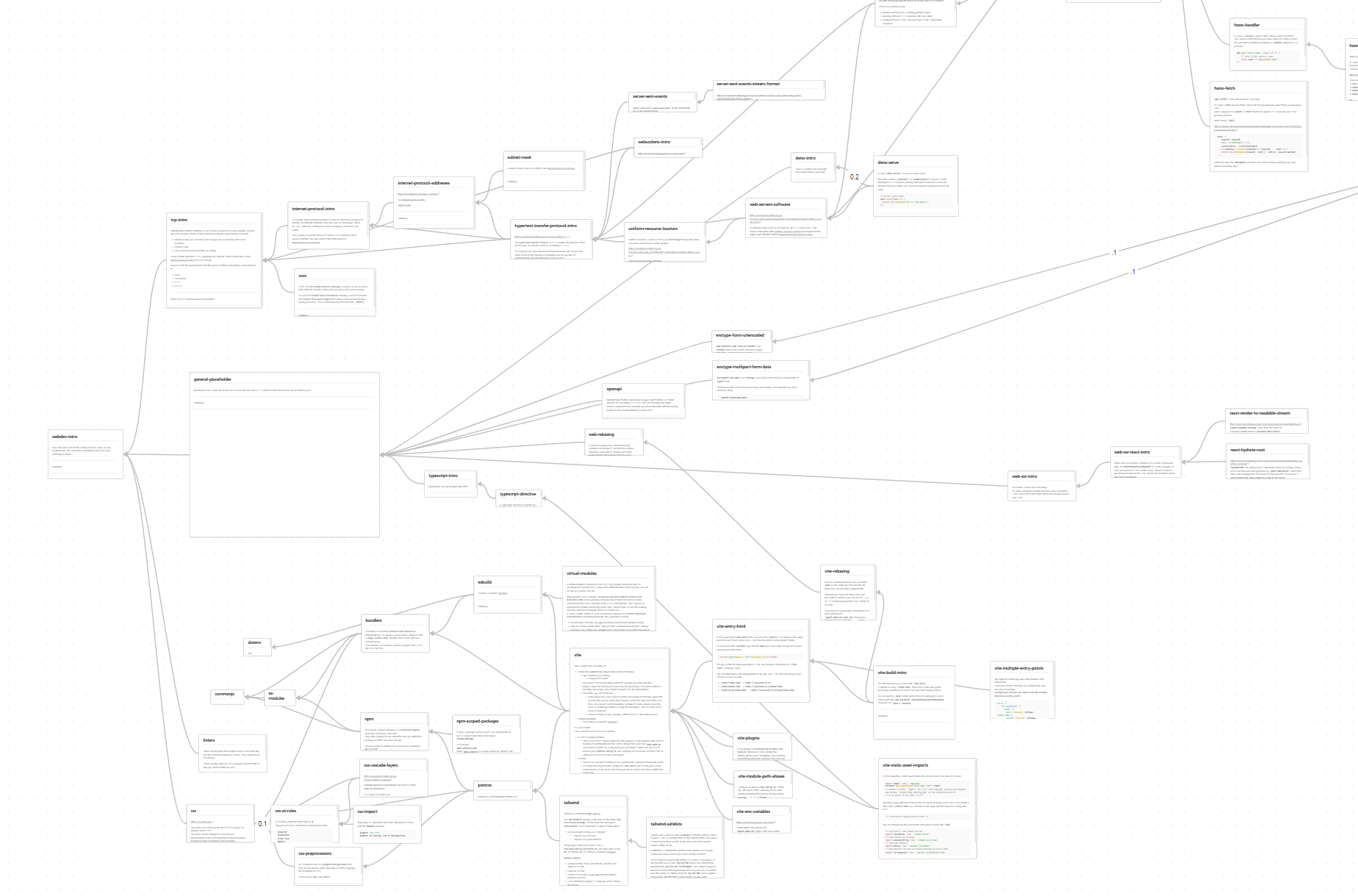
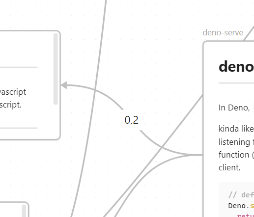
I can graphically “connect” topics by using Obsidian’s built-in canvas editor, and set their weights by putting a percentage:
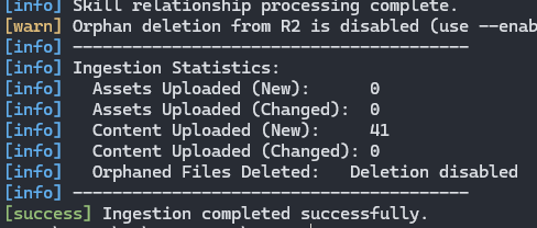
Then, using this Obsidian vault as a “source of truth”, I (vibe) developed a CLI tool that ingests everything in that curriculum folder and uploads everything to cloud storage. (I’m using Cloudflare R2 so I can expose everything to my TART website.) It also populates a Postgres database with edge connections between topics.
Some things I have to adjust to is thinking about how the topics I’m learning right now connect to previous topics. I can no longer just simply ignore past content and past notes; if I force myself to consider how to make each note interconnected with at least one other note, how someone would naturally build their knowledge only on top of pre-existing knowledge, then it forces me to make topics more granular and naturally related to others.
Additionally, having a visual graph like this means that I have a visual knowledge frontier. Roughly, I can pick out areas of growth that I can tend to by looking at the edge of my graph.
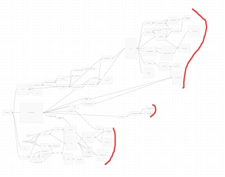
And from there, I can direct my research to go further in depth.
Now the only thing left to do is to make the website actually suggest topics and challenge me on them.